Introducing Breakdown

You get a ping late Sunday night from the CFO. Revenue is way down over the weekend. We need to figure out why, or at least have some good hypotheses about why, going into the Monday morning executive meeting.
What follows is a frantic search for a root cause. Were there fewer new customers, or was there more churn? If there were fewer new customers, were there fewer trial starts a week ago, or was the conversion rate down? And was the change isolated to one particular group of users: one geographic area, one app version, users who just signed up, or users who have been using the free tier for a while? I’ve been there too many times, Zoom window open with the CFO who is going through every possible dashboard, me sweating late at night and typing SQL frantically into the Snowflake console, in an unstructured search for an explanation. It’s one of my least favorite ways to spend my time.
It bothers me that this process is entirely predictable, and we should be able to automate it. We’re really doing two things in those late night scrambles:
- We look at each upstream metric in turn, each thing that could feasibly have caused the metric that moved to move the way it did. We traverse an unarticulated metric tree that lives in our heads.
- We slice each of those metrics in various ways (by geography, user cohort, app version, subscription tier, etc) looking for one or more subsets of users that caused the change we observed.
That frantic, manual search does often turn up some good results. But aside from the toll it takes on everyone, it has some big limitations. We’re essentially looking for correlations (whether we’re calculating coefficients or just eyeballing lines moving in the same direction), and the more possible correlations we evaluate, the more likely we are to find spurious correlations. The wider we search, the more false positives we will find. And even if we find some good ones, we’re stuck at that meeting prefacing everything we say with “correlation is not causation, but…”. We have no methods to understand causality, or more precisely, to estimate the probability that one factor actually caused the problem we saw.
The metric tree
The manual process relies on a theory of the business that lives in our heads. I have pieces of it, the CFO has other pieces, and we’re trying to construct it together at the time of analysis so that we can define where to look for a cause. When I heard about metric trees, I realized that they are precisely this kind of map, formalized ahead of time rather than in the moment of analysis.
At their simplest metric trees are just a diagram: boxes for metrics (things we can know and measure) and arrows for causal relationships. Some of those causal relationships are simple, deterministic relationships, like new memberships × average selling price = new revenue. Those get solid arrows. Others are influence relationships, where the effect is probabilistic, like increases in web visits tending to cause increases in signups. Those get dotted line arrows. Drawn on a whiteboard with stakeholders, that map holds a lot of value all by itself, and I do it with almost all my clients. Written down in a structured computer file, it defines a DAG, a Directed Acyclic Graph, mapping causality in very much the way a statistician would begin the formal process of designing a causal inference analysis.
Drawing that metric tree ahead of time helps with all of the problems above. Because a metric tree is a DAG, we can compute over it, automating and systematizing the search up the causal stream from the metric we observed to the metrics that may have caused it. We don’t have to conjure the map from our minds in the moment, we already have it and the computer can do that search. The metric tree also constrains the search for correlations to the plausible ones, and we can search through the possibilities systematically. By looking at fewer possibilities we find fewer spurious correlations. And we can do better than correlations. The whole field of causal inference uses DAGs to organize analyses of causality, and we can do that with our metric tree as well.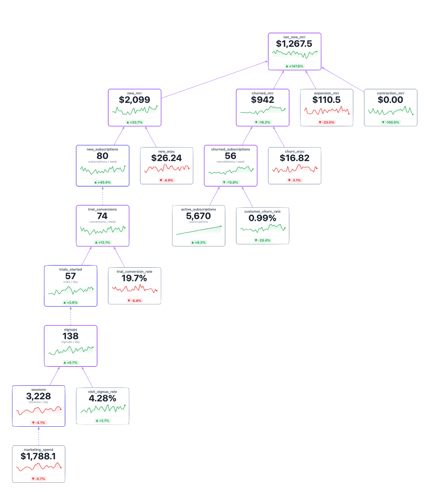
Metric trees are gaining adherents in analytics (and even attracting some critics). Mixpanel and Count.co both support building metric trees in their products, where they are positioned as a business intelligence paradigm that helps companies understand the connection of big, important outcome metrics to the proximate metrics that teams can work to move. But those stop short of doing any rigorous causal inference over the tree. And I couldn’t find any open source packages that help teams build or analyze metric trees.
Breakdown
I created Breakdown, an open source software package for building and learning from metric trees. I built it to meet the needs of my current clients, with a lot of valuable input from them, and to address some of the pain points of being a data scientist over many years. I’m really excited about what it can do. So far it allows you to:
- Easily define a metric tree in YAML, leveraging the metrics already defined in your dbt project.
- Visualize the metric tree with live metrics, sourced from the data warehouse.
- Conduct a root cause analysis to understand what drove a change in any metric. Select a metric and two time periods, and Breakdown looks at all the metrics upstream to conduct a rigorous root cause analysis. It uses Bayesian structural time series and Shapley values to understand even the probabilistic causes, and gives you credible intervals.
- Simulate changes in the business with “what if” mode. Freeze your data at any point in time, adjust one or more metrics up or down, and see how that ripples through your business.
I think all of these are useful tools, but I’m most excited about the root cause analysis. That’s partly because the statistics behind it are fun. But mostly I’m excited about it because it takes on that Sunday night problem.
How it works
There are two different attribution problems in a metric tree, and Breakdown treats them differently.
Where the edge is deterministic — an exact formula like new revenue = new memberships × average selling price — there’s nothing to learn. The only question is how to divide the observed change fairly among the parents (how much of the change in new revenue is driven by changes in new memberships and how much is driven by changes in average selling price). Breakdown computes exact Shapley values, day by day across both windows.
Other edges are probabilistic, and that’s where the statistics get fun. web visits influence signups, but there is uncertainty about how big the effect of increasing web visits will be on signups. We know there is an effect, but we can’t say ahead of time exactly how big the effect will be. In these cases, Breakdown fits a Bayesian structural time series (BSTS) model — a method that decomposes a metric’s history into a slow-moving local trend, seasonal cycles, and the influence of its parent metrics, estimating each one with its own uncertainty. The model fits strictly on data before the window you’re asking about, so it learns how these metrics normally relate to each other rather than letting the anomaly you’re investigating drag the coefficients around. A parent metric’s contribution is then the coefficient it learned times that parent metric’s change. Or technically, because it’s a Bayesian method, it’s a posterior distribution over that contribution, which is what lets you say how uncertain the estimate is.
There are two more things I like about the BSTS approach. The trend and seasonal terms get reported as their own components rather than dumped into the residual, so an uneven weekday mix between your two windows shows up as seasonality instead of as somebody’s fault. And whatever is left over is reported as unexplained. A large unexplained is a real answer — it says the drivers you modeled don’t account for this move — and I’d much rather see that than watch a tool distribute the gap across whichever parents it happens to know about.
The other thing we do in those late night searches for explanations is slicing metrics into subsets. In Breakdown, slicing runs off dimensions you declare for each metric, pointing at group-bys that already exist in your semantic layer — customer__region, device, plan. They’re fetched at analysis time and never enter the model fit, so declaring a dimension can’t change your results; it just gives the search somewhere to go. For metrics that add up across slices (user counts, total dollars) the slices are an exact sum identity, so each slice’s attribution is simply its own change. For rates it’s a Bennet decomposition, which splits each slice into within — that segment’s own rate moved — and mix, traffic shifting toward or away from it. Slices are then ranked by excess concentration rather than raw size. Excess expresses how much more of the change a slice carries than its size predicts. When nothing is concentrated, Breakdown says so — every slice comes back flagged noise-level — instead of naming whichever one sorted first.
What you get back from Breakdown is a ranked list of candidate causes, and for each node in the tree: its change, each parent’s contribution with a 95% credible interval and the probability the effect runs in the direction shown, and the unexplained remainder. It’s a prioritized list of where to look for a cause.
It saves the analyst a ton of time by searching systematically through the pre-defined metric tree and the pre-defined slices of each metric. But I want to be clear: it does not tell you directly what caused the change you saw. That requires follow-up, using additional context to explain. If the decline isolates to the latest app version, you’ll want to look at what shipped last week. If it’s in a specific country, you’ll want to look for holidays or events in that country. If it leaves a large share of the change unexplained, you’ll want to look for what is not defined in the metric tree. It doesn’t replace the holistic analysis. But it does dramatically narrow it, and leave you prepared for that Monday morning meeting with a solid set of hypotheses, credible intervals that estimate certainty, and a good understanding of what did not cause it.
Breakdown from your chat window
I also know that plenty of people have more than enough dashboards in their life, and are never going to want to look at another analytics UI. They want to ask their chat bot “what happened to revenue last week?” and get an answer. So Breakdown ships an MCP server, and the whole engine is available to an LLM as tools.
The chat bot takes your question and translates it to the input parameters for Breakdown, Breakdown fits the model and returns its report, and the chat bot then interprets the results and crafts a narrative about what might be happening. I think it’s a good division of labor. An LLM turned loose on a warehouse will write a lot of SQL and find a lot of correlations, and it has exactly the multiple comparisons problem we do, minus the instinct to be embarrassed about it. If you’ve tried it, you know that Claude or ChatGPT will eagerly find a pattern in anything and enthusiastically report what it found.
Breakdown does the part that has to be rigorous — traversing the declared tree, fitting the models, computing the attributions and the intervals — and hands back a structured result. The LLM does the part it’s genuinely good at, turning that result into a narrative for whoever asked, and then standing by for follow-up questions. It could even pull in additional context about releases or marketing campaigns if you let it.
The MCP attaches a how_to_read block to Breakdown’s reports, so the LLM has the caveats and interpretation guidance alongside the numbers at the moment it writes the story. And every response carries a link back into the UI that replays the same analysis.
Here’s what that looks like against our demo instance, a synthetic subscription business where we planted the anomalies on purpose:
What happened to new MRR in February?
New MRR ran about 15% below January — roughly $252 a week — comparing the four weeks ending March 8 against the four weeks ending February 1.
It’s a volume problem, not a pricing or a quality problem. Essentially all of the decline traces to fewer new subscriptions. Average revenue per new subscription actually rose over the same period and offset about a quarter of the damage, which means the headline understates what happened to acquisition. Walking further up: new subscriptions fell because trial conversions fell, and trial conversions fell because fewer people started trials, not because a smaller share of them converted — the conversion rate accounts for about 2% of the movement.
Because trials run a week, that conversion drop was measured against trials started February 2 – March 1 rather than against the same calendar weeks. Signups over that earlier window were down about 10%.
Slicing signups by device: mobile carries 90% of the decline while making up 52% of baseline volume. That’s the concentration. Slicing the same drop by country turns up nothing — no geography carries more of the decline than its size predicts, and every slice comes back at noise level.
The arithmetic reconciles exactly at the top of the tree, so nothing is hiding in the remainder. The whole question is what happened to mobile signups starting the first week of February. A release, a broken call-to-action, a tracking change on mobile web are all consistent with this shape; the tree can tell you where, it can’t tell you which.
Try it
Breakdown is open source and lives at github.com/PolycultureResearch/breakdown. If you have a dbt project with a semantic layer worth pointing at, you are most of the way to a working tree already — authoring the YAML is not the hard part. Issues and pull requests are welcome, and so is a note telling me the analysis got something wrong.
I have a live demo built on synthetic business data (that’s where the example above comes from). In that fake business, every anomaly was planted on purpose so you can check the answers against ground truth. It’s a better introduction than the README. If you’d like to check out the demo or talk more about Breakdown, Send me an email and I’ll get you set up.